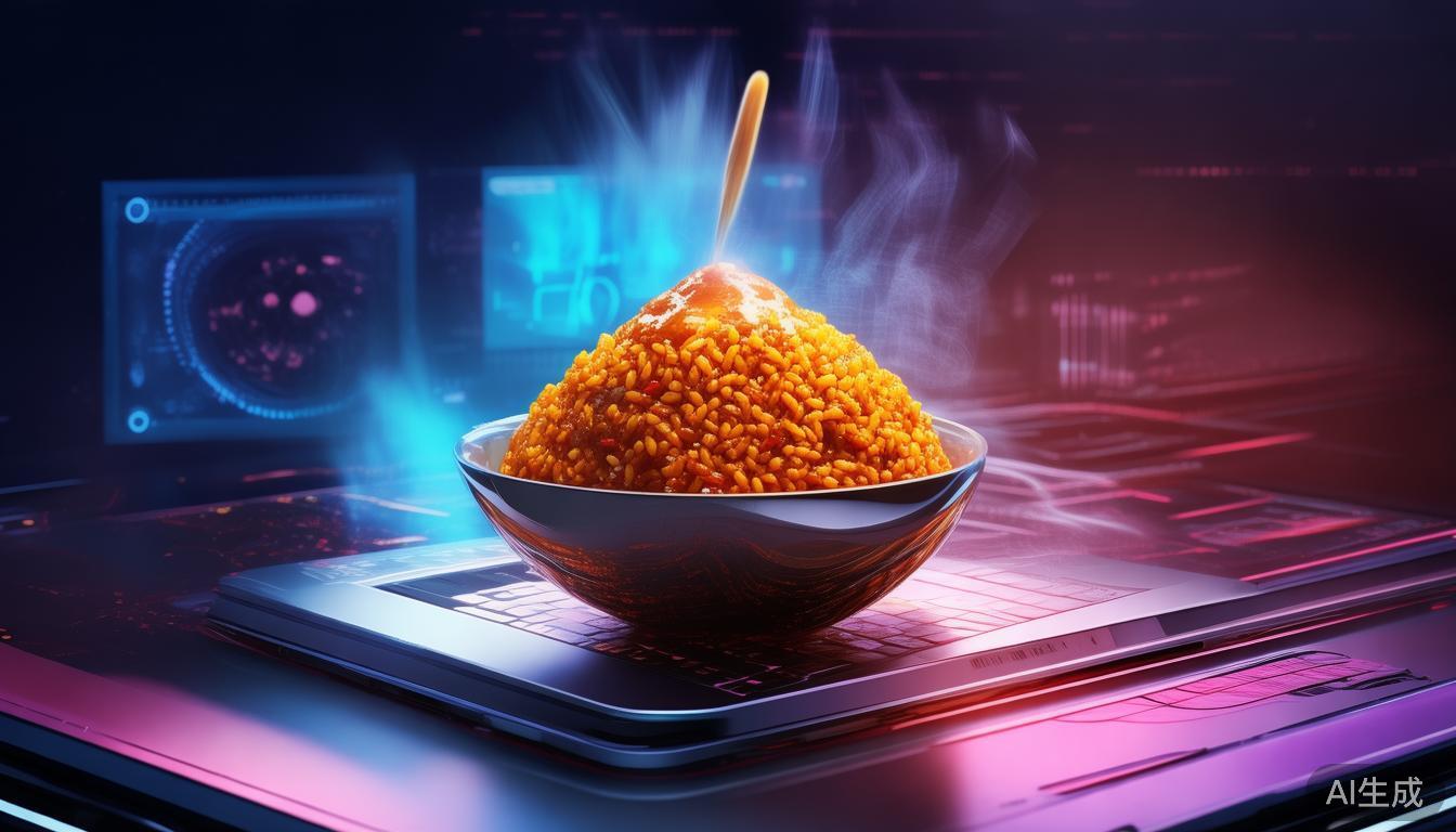
纯CSS制作的一碗木薯饭:一段代码中的美食之旅
木薯饭。不仅仅是因为这是我从小吃到大的食物,还因为它是我家乡每个派对上都会出现的菜肴——那是一个每个人都争抢的锅。我想让这个作品包含米饭堆、炸木薯、水煮蛋和总是放在最上面的斯科奇本纳辣椒。如果没放,那就不是木薯饭。
对于不熟悉的人来说,木薯饭是一道色彩鲜艳、风味独特、深受西非地区喜爱的炖菜,各地区的变种都为其增添了独特的风味。它是庆祝活动中的必备佳肴,是社区的象征,也是简单食材完美融合的证明。但如果我们不仅能在厨房里,还能在数字领域,仅用CSS捕捉这道深受喜爱的菜肴的精髓呢?
这正是Charles Ezeh在前端挑战 - 舒适食物版,CSS艺术提交的作品中所尝试做到的。正如其名称所示,这项挑战要求参与者仅使用CSS创建他们最喜欢的舒适食物的视觉表现。Charles选择了木薯饭,结果是一个令人惊叹、交互式的作品,将这道菜肴带到了网页上。
木薯的艺术:视觉解构
乍一看,这个CSS木薯饭是简约与创意的杰作。Charles精心解构了这道菜肴,将其分解为其组成部分:米饭、木薯、鸡蛋和火热的斯科奇本纳辣椒。每个元素都经过精心制作,使用了任何前端开发者都会为之惊叹的CSS技巧。
米饭堆
任何木薯饭菜肴的基础都是米饭本身。Charles使用CSS创建了一堆逼真的米饭,包括逼真的纹理和颜色渐变。以下是让米饭栩栩如生的CSS代码片段:
.jollof-rice {
  background: linear-gradient(to bottom, #f8e9d6, #e8c9a8);
  border-radius: 50% 50% 40% 40%;
  box-shadow: 0 4px 8px rgba(0, 0, 0, 0.1);
  position: relative;
  overflow: hidden;
}
这段CSS使用线性渐变来模拟米饭堆积的方式,底部颜色较深,顶部颜色较浅。border-radius和box-shadow增加了深度和真实感,使米饭看起来几乎触手可及。但还没完。Charles添加了微妙的动画,让米饭产生蒸汽感:
@keyframes steam {
  0% { transform: translateY(0); opacity: 0.8; }
  50% { transform: translateY(-10px); opacity: 0.6; }
  100% { transform: translateY(0); opacity: 0.8; }
}

.steam {
  position: absolute;
  top: -10px;
  left: 50%;
  transform: translateX(-50%);
  width: 20px;
  height: 40px;
  background: rgba(255, 255, 255, 0.6);
  border-radius: 50%;
  animation: steam 2s infinite ease-in-out;
}
这些小细节将米饭从平面形状提升为动态元素,增加了菜肴的整体真实性。
炸木薯
没有木薯饭是不完整的,没有金黄酥脆的甜木薯。Charles使用CSS创建了一片看起来几乎可以吃的木薯。这里的诀窍是使用border-radius给木薯赋予其特有的弧度,结合渐变来模拟金黄的颜色:
.fried-plantain {
  background: linear-gradient(to right, #f5d76e, #f9e79f);
  border-radius: 40% 40% 60% 60%;
  box-shadow: 0 4px 8px rgba(0, 0, 0, 0.1);
  position: absolute;
  top: 20%;
  left: 30%;
}
木薯还被赋予了微妙的旋转和倾斜,使其看起来像是放在一个微小的斜坡上,增加了真实感。Charles甚至使用伪元素给木薯添加了一个小裂缝:
.fried-plantain::after {
  content: '';
  position: absolute;
  top: 30%;
  left: 20%;
  width: 2px;
  height: 20px;
  background: rgba(0, 0, 0, 0.2);
  transform: rotate(45deg);
}
这个小细节为木薯增添了个性,使其看起来更像一个经历过加热的真实木薯片。
水煮蛋
鸡蛋是木薯饭中简单却必不可少的组成部分。Charles使用CSS创建了一个逼真的鸡蛋,包括蛋黄和裂缝。鸡蛋放在米饭上,使菜肴看起来更加完整:
.boiled-egg {
  position: absolute;
  top: 10%;
  left: 50%;
  transform: translateX(-50%);
  width: 30px;
  height: 30px;
  background: radial-gradient(circle at 30% 30%, #fff, #f0f0f0);
  border-radius: 50%;
}
鸡蛋被赋予了轻微的倾斜,使其看起来像是要从米饭上滚下来。Charles还使用伪元素给鸡蛋添加了一个裂缝:
.boiled-egg::before,
.boiled-egg::after {
  content: '';
  position: absolute;
  top: 50%;
  left: 50%;
  width: 2px;
  height: 10px;
  background: rgba(0, 0, 0, 0.2);
  transform: translate(-50%, -50%) rotate(45deg);
}
这些小细节使鸡蛋看起来更加逼真,并增加了菜肴的整体美感。
斯科奇本纳辣椒
没有木薯饭是不完整的,最上面总是放着一颗火热的斯科奇本纳辣椒。Charles使用CSS创建了一个逼真的辣椒,包括其特有的形状和颜色:
.scotch-bonnet-pepper {
  position: absolute;
  top: 0;
  left: 50%;
  transform: translateX(-50%) rotate(45deg);
  width: 20px;
  height: 30px;
  background: linear-gradient(to right, #ff4500, #ff8c00);
  border-radius: 50% 50% 40% 40%;
}
辣椒被赋予了轻微的倾斜,使其看起来像是在米饭上休息。Charles还使用伪元素给辣椒添加了一个小茎:
.scotch-bonnet-pepper::before {
  content: '';
  position: absolute;
  top: -5px;
  left: 50%;
  transform: translateX(-50%);
  width: 4px;
  height: 10px;
  background: #8B4513;
  border-radius: 2px;
}
这个小细节为辣椒增添了个性,使其看起来更像一颗刚刚被添加到菜肴中的真实斯科奇本纳辣椒。
交互元素:让菜肴活起来
Charles的CSS木薯饭最令人印象深刻的部分之一是其交互性。这道菜肴不仅仅是一个静态图像;它是食物的动态表现,其中的元素会响应用户交互。这增加了一层参与感,使体验更加愉快和难忘。
例如,米饭有一个微妙的动画,使其产生蒸汽感,如前文所述。木薯和鸡蛋也有小动画,使它们看起来更加逼真。这些动画不只是为了展示;它们有目的,使菜肴看起来像是刚从厨房端出的新鲜食物。
CSS的力量:不仅仅是样式
这个项目证明了CSS的力量和前端开发者的创造力。CSS通常被认为只是一种样式语言,但正如Charles的项目所示,它可以用来创建复杂、交互式和视觉上令人惊叹的艺术作品。仅用CSS创建逼真的图像和动画的能力,证明了这项技术的多功能性和力量。
启示
Charles Ezeh的“纯CSS制作的一碗木薯饭”不仅仅是一项前端挑战的提交;它是对创造力、文化和代码力量的庆祝。它表明,只要有巧思和热情,前端开发者就能创造出真正特别的东西。这个项目不仅展示了开发者的技术实力,还突出了通过数字艺术展现文化遗产之美。这是一个提醒,代码不仅可以用来创建功能性的网站,还可以用来创作艺术品,将人们聚集在一起,讲述一个故事。
A Bowl of Jollof Rice in Pure CSS: A Culinary Journey Through Code
Jollof rice. Not just because it's food I grew up eating, but because it's the dish that shows up at every party back home — the one pot everyone fights over. I wanted the piece to have the mound of rice, the fried plantain, a boiled egg, and the scotch bonnet pepper that always ends up on top. If it does, it's not Jollof.
For those unfamiliar, Jollof rice is a vibrant, flavorful one-pot dish beloved across West Africa, with regional variations adding their own unique twist. It's a staple at celebrations, a symbol of community, and a testament to the power of simple ingredients coming together in perfect harmony. But what if we could capture the essence of this beloved dish not just in a kitchen, but in the digital realm, using nothing but CSS?
This is exactly what Charles Ezeh set out to do in his submission for the Frontend Challenge - Comfort Food Edition, CSS Art. The challenge, as the name suggests, tasked participants with creating a visual representation of their favorite comfort food using only CSS. Charles chose Jollof rice, and the result is a stunning, interactive piece that brings the dish to life on the web.
The Art of Jollof: A Visual Deconstruction
At first glance, the CSS Jollof rice is a masterpiece of simplicity and creativity. Charles meticulously deconstructed the dish, breaking it down into its constituent parts: the rice, the plantain, the egg, and the fiery scotch bonnet pepper. Each element is crafted with precision, using CSS techniques that would make any frontend developer sit up and take notice.
The Mound of Rice
The foundation of any Jollof rice dish is the rice itself. Charles uses CSS to create a realistic mound of rice, complete with realistic texture and color gradients. Here's a snippet of the CSS that brings the rice to life:
.jollof-rice {
  background: linear-gradient(to bottom, #f8e9d6, #e8c9a8);
  border-radius: 50% 50% 40% 40%;
  box-shadow: 0 4px 8px rgba(0, 0, 0, 0.1);
  position: relative;
  overflow: hidden;
}
This CSS uses a linear gradient to mimic the way rice piles up, with darker shades at the bottom and lighter shades at the top. The border-radius and box-shadow add depth and realism, making the rice look almost tangible. But it doesn't stop there. Charles adds subtle animations to give the rice a sense of movement, as if it's steaming:
@keyframes steam {
  0% { transform: translateY(0); opacity: 0.8; }
  50% { transform: translateY(-10px); opacity: 0.6; }
  100% { transform: translateY(0); opacity: 0.8; }
}

.steam {
  position: absolute;
  top: -10px;
  left: 50%;
  transform: translateX(-50%);
  width: 20px;
  height: 40px;
  background: rgba(255, 255, 255, 0.6);
  border-radius: 50%;
  animation: steam 2s infinite ease-in-out;
}
These small details elevate the rice from a flat shape to a dynamic element, adding to the overall realism of the dish.
The Fried Plantain
No Jollof rice is complete without the golden-brown, sweet plantain. Charles uses CSS to create a slice of plantain that looks almost good enough to eat. The key here is the use of border-radius to give the plantain its characteristic curve, combined with a gradient to simulate the golden-brown color:
.fried-plantain {
  background: linear-gradient(to right, #f5d76e, #f9e79f);
  border-radius: 40% 40% 60% 60%;
  box-shadow: 0 4px 8px rgba(0, 0, 0, 0.1);
  position: absolute;
  top: 20%;
  left: 30%;
}
The plantain is also given a subtle rotation and tilt to make it look as if it's resting on a slight incline, adding to the realism. Charles even adds a small crack to the plantain, using a pseudo-element:
.fried-plantain::after {
  content: '';
  position: absolute;
  top: 30%;
  left: 20%;
  width: 2px;
  height: 20px;
  background: rgba(0, 0, 0, 0.2);
  transform: rotate(45deg);
}
This small detail adds character to the plantain, making it look more like a real slice that has seen some heat.
The Boiled Egg
The egg is a simple yet essential component of Jollof rice. Charles uses CSS to create a realistic egg, complete with a yolk and a crack. The egg is placed on top of the rice, giving the dish a sense of completeness:
.boiled-egg {
  position: absolute;
  top: 10%;
  left: 50%;
  transform: translateX(-50%);
  width: 30px;
  height: 30px;
  background: radial-gradient(circle at 30% 30%, #fff, #f0f0f0);
  border-radius: 50%;
}
The egg is given a slight tilt to make it look as if it's about to roll off the rice. Charles also adds a crack to the egg, using a pseudo-element:
.boiled-egg::before,
.boiled-egg::after {
  content: '';
  position: absolute;
  top: 50%;
  left: 50%;
  width: 2px;
  height: 10px;
  background: rgba(0, 0, 0, 0.2);
  transform: translate(-50%, -50%) rotate(45deg);
}
These small details make the egg look more realistic and add to the overall aesthetic of the dish.
The Scotch Bonnet Pepper
No Jollof rice is complete without the fiery scotch bonnet pepper on top. Charles uses CSS to create a realistic pepper, complete with its characteristic shape and color:
.scotch-bonnet-pepper {
  position: absolute;
  top: 0;
  left: 50%;
  transform: translateX(-50%) rotate(45deg);
  width: 20px;
  height: 30px;
  background: linear-gradient(to right, #ff4500, #ff8c00);
  border-radius: 50% 50% 40% 40%;
}
The pepper is given a slight tilt to make it look as if it's resting on the rice. Charles also adds a small stem to the pepper, using a pseudo-element:
.scotch-bonnet-pepper::before {
  content: '';
  position: absolute;
  top: -5px;
  left: 50%;
  transform: translateX(-50%);
  width: 4px;
  height: 10px;
  background: #8B4513;
  border-radius: 2px;
}
This small detail adds character to the pepper, making it look more like a real scotch bonnet that has just been added to the dish.
Interactive Elements: Bringing the Dish to Life
One of the most impressive aspects of Charles's CSS Jollof rice is the interactivity. The dish isn't just a static image; it's a dynamic representation of the food, with elements that respond to user interaction. This adds an extra layer of engagement, making the experience more enjoyable and memorable.
For example, the rice has a subtle animation that gives it a sense of steam, as mentioned earlier. The plantain and egg also have small animations that make them look more realistic. These animations are not just for show; they serve a purpose, making the dish look more like it's about to be served fresh from the kitchen.
The Power of CSS: More Than Just Styling
This project is a testament to the power of CSS and the creativity of frontend developers. CSS is often seen as just a styling language, but as Charles's project shows, it can be used to create complex, interactive, and visually stunning pieces of art. The ability to create realistic images and animations using only CSS is a testament to the versatility and power of this technology.
Takeaway
Charles Ezeh's "A Bowl of Jollof Rice in Pure CSS" is more than just a submission for a frontend challenge; it's a celebration of creativity, culture, and the power of code. It shows that with a little bit of ingenuity and a lot of passion, frontend developers can create something truly special. This project not only showcases the technical prowess of the developer but also highlights the beauty of cultural heritage through digital art. It's a reminder that code can be used to create not just functional websites, but also works of art that bring people together and tell a story.